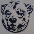
"...as you can see" a couple of rather poor samples of the LP logo presented without logical
explanation of their 'proof' of the disagreement with my post of 3 days
earlier! It rather gives a lie to their attempts to claim my blog isn't worth visiting;
they appear to be glued to it, shadowing it and getting unduly excited by it!
"Here
we have some of the IDL animals." Says Paul, adding "There seems to be some confusion with some
people that marking is LP for Lucky Products.
We will have to disagree as you can see."
Really? In other words; see what?
Disrespectful nastiness dressed-up as disagreement; that's what! ". . . some people . . ." manner'less
louts! They castigate me for earthy language and then talk in cowardly riddles,
as if I'm the cat's mother! And again - no logical argument, no evidence, no
supporting 'workings out', just a desire to disagree without good cause!
We all (lots of people in the hobby) used
to think it was ID or IDL (ID
Ltd.?), but if you're going to argue a point it's best to present some
evidence for your choice; a few blurry base marks 'aint it. Most of us came to
the conclusion that it was actually LP
when the clearer mark was first found/first appeared on packaging, with the
monster's elbows clearly visible . . .
. . . as here on the right. I explained all
this the other day, but will do so again for the bucket/tap sorts.
In the Army there were two kinds of man,
those who could be trusted with the command "Fill a bucket for us mate" and those who needed the command
"You, private, see that bucket there?
Take it to the tap, that one; over there, fill it so you don't spill it while
carrying it, and then carry it back here", the rest of this post is
for those types of men.
If it is assumed to be ID, you are left with spurious bits of nonsensical graphic geometry
at the bottom of the logo and a 'D' which is of a larger size or different font
from the 'I'
If it is assumed to be IDL you are still left with an oblong oddment! While the font-size
variation only grows - with a huge, yet short, flat 'L'?
However; if you assume it to be LP you are
left with two capital letters of the same font, standing side-by-side, the same
size (ignore the variance resulting from my Wacom Volito scribbling), the 'P' held slightly higher and no
leftovers! Only the bar running through them to explain; which is easily done
if you can see the monster . . .
. . . .gripping them in his arms; the
elbows of which are clearly revealed in the printed version of the logo - "Seemples"
The contention I referred to in the post
linked to above, was the relationship I postulated to, as existing between LP and The Lucky Toys, not the logo which was settled by wise men in Plastic Warrior or One Inch Warrior magazines about 20 years ago, or so I thought it
had been - until those two Muppets started using the archaic belief again like secret
Catholic flagellants!
In the orgasmic passion of their eager,
hurried desire to argue with me (on any point - this is the third or fourth
veiled 'dig' in the last few months) the clowns appear to have tripped each
other into the bucket of custard they had hoped to throw over me!
May their wickedness light upon their own
heads.
The logo is LP held within the bear-hug of a bat-eared monster with piggy-eyes,
and while the terrible twatish two'oh clean themselves off and plot their next
stunning shot in this risible war - which they clearly started with no advise
from their betters - I will continue to Blog small scale railway accessories, unknown
war-gaming metal, pencil tops, erasers, chocolates, Daleks, bits of coral reef,
pooper-troopers, museum exhibits, snails, motorcycles, Octonauts, elephants and
all sorts of other things which mean I don't need to envy them or try to be
like them in any way - shudders at the thought of such a tedious, humourless
existence.
And - as this is obviously a fatuous post - I'll chuck something else up here later today, maybe some Res . . . . or is it Basa!
Since corrected to Lik Be / LB. Which makes little change to the original criticism, just that I was half wrong, and they were twice as wrong for taking my lead!


4 comments:
Oh, well explained, sir!
Cheers Andy, I think most of us got it years ago, but there's always o...two in Pennsylvania who take a little longer!
h
Hi, just came across your blog while researching this logo. I know this is an old post, but just in case the thread is still open, I think I will have to agree with you. Is there is possibility to add an image to this comment? Thanks
Absolutely Anon', but the knowlage has moved on . . . The cypher is almost cirtainly a poor LB for the Hong Kong maker Lik Be
H
eMail me the image at maverickatlarge[at]hotmail[dot]com
Post a Comment