About Me
- Hugh Walter
- No Fixed Abode, Home Counties, United Kingdom
- I’m a 60-year-old Aspergic gardening CAD-Monkey. Sardonic, cynical and with the political leanings of a social reformer, I’m also a toy and model figure collector, particularly interested in the history of plastics and plastic toys. Other interests are history, current affairs, modern art, and architecture, gardening and natural history. I love plain chocolate, fireworks and trees, but I don’t hug them, I do hug kittens. I hate ignorance, when it can be avoided, so I hate the 'educational' establishment and pity the millions they’ve failed with teaching-to-test and rote 'learning' and I hate the short-sighted stupidity of the entire ruling/industrial elite, with their planet destroying fascism and added “buy-one-get-one-free”. Likewise, I also have no time for fools and little time for the false crap we're all supposed to pretend we haven't noticed, or the games we're supposed to play. I will 'bite the hand that feeds', to remind it why it feeds.
Sunday, April 26, 2026
H is for Housekeeping
Saturday, April 13, 2024
F is for Fort Mavrick, without the E!
Heay! For years, they thought I was 'only' dyslexic! We had a group-project at Uni', where we had to renovate/rebuild/replace (the choice was rather ours, but front and back walls had to line up) a crescent, down near Elephant & Castle, and after weeks of individual project work, Design crit's, building crit's, more crit's and so on, we were required to place them altogether for the end-of-year exhibition, to which parents and the like were invited, which left us having to fill the empty corner with something, we whacked in a roundabout I think, and some formal beds, but I thought the kids who might live in our eclectic collection of . . . . dewllings (?) might like a play area, so this was born, literally overnight, as it wasn't part of the marking process!
Wednesday, March 13, 2024
T is for That Was My Idea, That Was!
Thursday, January 18, 2024
A is for Apparently . . . .
. . . it's national thesaurus day, somewhere!
"I successfully predict that upon which you cogitate; did I empty the ammunition storage chambers, or only partially expend their contents? And - should you wish to be appraised of the facts - in all the preceding, heated kerfuffle, I appear to have purely failed to register that data? Therefore, the quandary with which you have to present yourself, is thusly - Do you feel blessed with good fortune, juvenile delinquent? Verily, comment upon that?"
"The pinnacle of the planetary sphere, mother, the pinnacle of the planetary sphere!"
"The advancing object is in no way a Luna body!" . . . "It's a moment of captive deceit!"
"It's a form of existence, Jim, but in a manner we would not comprehend it as, in the normal course of events."
"May the measure of nonequilibrium accompany you, adolescent Skywalker!"
Tuesday, April 11, 2023
B is for Bookplates - 5 - Mine
The little blue sketch may be the first version, but therein lies the problem with the whole design, I eschewed the designs which used the tracing of rights-free stuff, and commercial lettering, for something wholly my own work . . . for my own bookplate; makes sense, right?
Monday, April 10, 2023
B is for Bookplates - 4 - Drafts
Thursday, November 10, 2022
F is for Fatabet - the Slimfont of Self-indulgence!
The pages of my old sketch-book from collage, back in 1981-3, and my attempts to design an alphabet in which all the letters were contained within a circle; I think there were a couple in the 1970's; Lettraset did one with smiley-faced suns I think, but despite having both Lettraset and Mechaorama catalogues, I didn't crib from them (if they come out of storage I'll compare the closest, but they may have been lost in a flood back in 2007?), and sort of gave-up when I couldn't solve a couple of letters, the 'B' was one and the 'D' which still niggles! However, CAD was an obvious opportunity to have another stab at the old idea, and I quickly got some geometric rules established and started playing around with the harder letters and some punctuation. You can see that 'B' (and 'D') along with 'Q' are coming out of the circle and I'm still not 100% happy with the first 2, the 'Q' however works, as it's already an odd-one! I quickly used it for my signature block on all my drawing files/print-outs, and started thinking about other treatments; most fonts have a bold and italic version, so in playing-around I've ended up with several potentials!
And yes, the Fatabet got renamed Slimfont, although I know I could never use Fatboyslim, or Slimshady commercially, or not without passing many pieces of silver to two guys who probably have enough already!
Slimshady actually gave me the ultimate version (see below), while I don't think I named the one bottom-left, which ought to be Slim Outline but I already used Slimout for the standard font, so maybe Slim Jazzy?
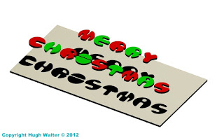
Here we see CAD'ed versions of Slimwall (greenish) and Fatboyslim (multicoloured), which - latter - gave me the idea for a Christmas card I think I posted here at the time - 2012? With a construction stage at bottom left, before I'd positioned the light-source for the shadows, and at bottom right, my prepared design doubled for printing on A3 card-stock. Which is here again! Well, it's only about six weeks away now! You use a single 'light' so the lines from the shadows, followed-back through the letters, all go to a single vanishing-point to enhance the 3D effect of the letters floating over the 'card' on the card!And no matter how bad the year's been I hope over the next few weeks, your Christmas this year shapes up to be better than the last two - it can't just keep getting worse . . . can it?
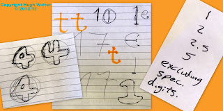
Some other stuff, even in the digital age, it seems a lot of paper still finds its way into the project folder, not all of it explainable, but clearly I've started tackling the numbers and looking at font-size or kerning (ratios of gaps between certain pairs of adjacent letters) or something!?? I don't think I ever progressed beyond the numerals you can see here (left) or have even got to choosing a final from some of those where there are alternatives shown, but I was doing it in college-time and had other stuff to get on with.Once I had a near finished alphabet (right) I moved on to other things and haven't got much further, I tweak something from time to time, but time's short these days, although I hope one day to put a finished version on a free-site like DAFonts.
One change you may have noticed is that the parallel line 'rule' established by the original 'A' and 'B' from my teenage version, which was carried on with the 'C', 'E' and 'F' (still not happy with 'D'!) and then taken through the whole alphabet, has now been dropped for 'W' following the enforced 'angle rule' for 'X' and 'Y', which I think makes it much better, the 'W' isn't just an upside down 'M', but a new letter in its own right!
Indeed you wonder if the reason all those angled letters are all at the back-end of the alphabet ('Z' is another) might be because when they were codifying it (monks? a Caesar?), they'd run out of strait and curved shapes/combinations which were suitably different from each other!
But back to Slimshady . . . once I was 3D CAD'ing more complicated solids than the pulled-out 2D of Fatboyslim, the obvious final progression was a fully 3D Fatabet (top right), which replaced my signature panel on the 'paper space' drawing files - main/left-hand image, taking the original circular disc concept to a full sphere.New 'W' mind! The constriction of boolean geometries meant some simplification to get the curved ogee 'edges' to go-in properly! In simple terms, boolean means "Right, OR wrong, there is NO grey", and if your invisible mesh, underlying everything, has a single fault, the whole thing is 100% wrong!
I'm actually tackling a letter 'R' in the bottom-right shot and you can see how you pull-up the 2D 'R' (white lines), leaving you with an extruded, R-shaped rod (red lines), which you then subtract from a solid sphere (pink Lines) leaving you with a stable ball-letter, that then needs some sharp-edges rounding-off, which is where it can all go very wrong; if the continuous ogee (which runs right around the edges of each 'trench' or hole) won't go-in when told to!
For instance, the ogee running round the larger trenches in the 'H', have to have a greater radius than the smaller trenches in the 'W', which can affect the visual uniformity of the different letters in the alphabet, a uniformity which is precisely what I've been trying to achieve sine 1981! 'D' notwithstanding - the bastard, so; you have to compromise at each stage, but these two look OK together . . . I think?
And . . . it's all good fun, that's the
thing, it's another skill, it's another life-experience, you know? Another box
ticked in an otherwise miserably short life. Parachuting is still on the list!
Thursday, April 14, 2022
S is for 'The' Shark!
So I don't know where the week's gone, but half of it snuck-by while I was doing something else! Anyway, what I was going to post at tea-time took a back seat, and, as I'd scanned these last night before their box went to storage, we'll have a bit of self-indulgence!
Back around '98, I had cause to design a shark, the main parameters being that A) it had to be executable on a vinyl-cutter and B) no one in the studio would show a mere fitter (for that is what I was!) how to use the CorelDRAW software! The irony there being that now I can 3D in Autodesk and the studio bods are probably still doing 2D signage!The above are early efforts to 'get' a shark, not as easy as I'd thought it would be when I started, also - an additional parameter - I was trying to get there from the Christian fish, but sharks 'aint fishes! As you can see, far left bottom; I got closer to barracuda and tuna at one point!
Using the tracing-over-the-previous-image technique, a seven stage process lead to something I was happy with, although the final stage (with teeth) is missing, it must have been lost in the final scanning-to-PC and cutting phase, where I did get help from Jason in the studio and when the gills and eye were added from punctuation. Once I was happy with the design, I had 12 printed-off in three colours, of which I have six left, the others having gone on various vehicles I have owned over the intervening 25 years . . . never mind this week, where the fuck has my life gone?!! Anyway, it became 'the shark' among my friends, and when I got a new vehicle it was always "You haven't put the shark on it yet then?" In case you're still wondering . . . this was going to go on the opposite side of the boot/tailgate, but I never got round to finalising the design or getting it cut! It's alright; they raise again on the third day, apparently, although the way I'm counting days at the moment, that'll probably be next Saturday!Thursday, January 20, 2022
B is for Blobby Blobby!
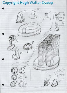
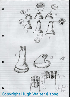
It started with a sketch, I had thought that you could have a chess set where the pieces were simply letters identifying the role of the piece, P for Pawn being the starting point, I then extruded the King to denote his seniority - despite the original idea being small flat magnetic 'travel chess' pieces - before I knew where I was going I had abstracted the Bishop (B), gone back to the Pawn, had another go at the King (top, and top-right), designed all their plan profiles (bottom-left) and got a Mk1 Pawn - bottom right. New sheet of paper; and designs I was happy with were quickly thrown-up, they aren't all the final designs, but the base was pretty-much decided upon and the idea of fluid lines and abstract designs were established, I was aiming for something between sand-blasted wood, and those turd-towers you make on the beach by dribbling very wet sand through your fingers. Well, some of us did!
Some of you will already have spotted an obvious mistake, but like walking away from a crossword puzzle and returning to it to get the clue you're stuck on, or after the 'Can't see the wood for the trees' aphorism, it took me (and the various tutors/fellow students involved in the below images) until preparing this article to spot it, so I'll save admitting it to the end!
I then modeled working prototypes in air-drying clay; the king's a bit droopy! I only have this low-res' crop out of a larger image of the old 'Cabinet of Curious Things', but a few years later I would be off on the CAD course, and these became a step on the way! Pretty-much as the clay ones but the Castle now wears a simplified version of the King's crown, and the Knight has lost his bulgy-eyes for little pin-pricks which only hint at a face, the bishop gets a deeper valley between finer sides to his mitre-hat. This is still a 2D flat space drawing, coloured with a gradation tool in the lower image to give a false appearance of 3D.Chees Set! Heay; they're working drawings
in cyberspace! It's an idea though, with that plastic American cheese - you could injection-mould them and once the game was finished (pawns/queens) you could eat them with crackers and a nice wine!
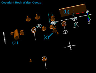
It was a bit like that with my Knight in the end, instead of lathe, saw and blade, I had the Boolean commands of extrusion, union, and subtraction, but it's a messy business while it's happening! I won't bore you with a detailed explanation of the steps but the main one is to pull out the whole profile (a), and the width of the head (b), subtract them from each other to get (c), which you then tweak with a standard base!
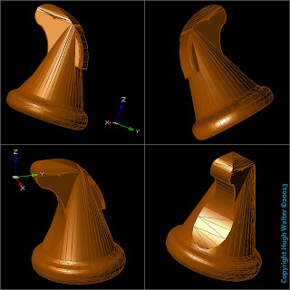
In the end I added a mane (of sorts) and the final piece works I think? I know some abstract, graphical or 'space-age' chess sets have Knights which don't look like 'knights', but in the end I felt a little homage to Jacques was in order! I don't seem to have replicated him four times and coloured him properly for these screen-shots but you can see how he'll slot-in and I think the overall works, the idea is to get it on one of the 3D printing sites, it'll be free, I can't see demand making it commercially viable and if it's free you can forget it once you've uploaded it! But he is here in this outline screen capcha'. The 'deliberate' mistake . . . I've got the King and Queen the wrong way round, the nipple should be the King and taller, while the rubber-glove full of air should be the Queen, and shorter! It's an easy job to switch them, but fancy not noticing for what's been 13 years since the first sketch! Anyway, I think it works and it'll give the haters something else to hate!Copyright Hugh Walter ©2009-2022
Thursday, February 4, 2016
D is for Deetail Details!
Just a comparison between the earlier silver and later Black Storm mounted Deetail Knights from Britains. The later one having the marginally more realistic appearance...apart from the chrome shield!
Also found this unused graphic I CAD'ed-up during the original series of articles, on the Britains dongle when putting the images away...just for fun...or something!


