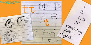
The pages of my old sketch-book from collage, back in 1981-3, and my attempts to design an alphabet in which all the letters were contained within a circle; I think there were a couple in the 1970's; Lettraset did one with smiley-faced suns I think, but despite having both Lettraset and Mechaorama catalogues, I didn't crib from them (if they come out of storage I'll compare the closest, but they may have been lost in a flood back in 2007?), and sort of gave-up when I couldn't solve a couple of letters, the 'B' was one and the 'D' which still niggles! However, CAD was an obvious opportunity to have another stab at the old idea, and I quickly got some geometric rules established and started playing around with the harder letters and some punctuation. You can see that 'B' (and 'D') along with 'Q' are coming out of the circle and I'm still not 100% happy with the first 2, the 'Q' however works, as it's already an odd-one! I quickly used it for my signature block on all my drawing files/print-outs, and started thinking about other treatments; most fonts have a bold and italic version, so in playing-around I've ended up with several potentials!
And yes, the Fatabet got renamed Slimfont, although I know I could never use Fatboyslim, or Slimshady commercially, or not without passing many pieces of silver to two guys who probably have enough already!
Slimshady actually gave me the ultimate version (see below), while I don't think I named the one bottom-left, which ought to be Slim Outline but I already used Slimout for the standard font, so maybe Slim Jazzy?
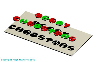
Here we see CAD'ed versions of Slimwall (greenish) and Fatboyslim (multicoloured), which - latter - gave me the idea for a Christmas card I think I posted here at the time - 2012? With a construction stage at bottom left, before I'd positioned the light-source for the shadows, and at bottom right, my prepared design doubled for printing on A3 card-stock. Which is here again! Well, it's only about six weeks away now! You use a single 'light' so the lines from the shadows, followed-back through the letters, all go to a single vanishing-point to enhance the 3D effect of the letters floating over the 'card' on the card!And no matter how bad the year's been I hope over the next few weeks, your Christmas this year shapes up to be better than the last two - it can't just keep getting worse . . . can it?
Some other stuff, even in the digital age, it seems a lot of paper still finds its way into the project folder, not all of it explainable, but clearly I've started tackling the numbers and looking at font-size or kerning (ratios of gaps between certain pairs of adjacent letters) or something!?? I don't think I ever progressed beyond the numerals you can see here (left) or have even got to choosing a final from some of those where there are alternatives shown, but I was doing it in college-time and had other stuff to get on with.Once I had a near finished alphabet (right) I moved on to other things and haven't got much further, I tweak something from time to time, but time's short these days, although I hope one day to put a finished version on a free-site like DAFonts.
One change you may have noticed is that the parallel line 'rule' established by the original 'A' and 'B' from my teenage version, which was carried on with the 'C', 'E' and 'F' (still not happy with 'D'!) and then taken through the whole alphabet, has now been dropped for 'W' following the enforced 'angle rule' for 'X' and 'Y', which I think makes it much better, the 'W' isn't just an upside down 'M', but a new letter in its own right!
Indeed you wonder if the reason all those angled letters are all at the back-end of the alphabet ('Z' is another) might be because when they were codifying it (monks? a Caesar?), they'd run out of strait and curved shapes/combinations which were suitably different from each other!
But back to Slimshady . . . once I was 3D CAD'ing more complicated solids than the pulled-out 2D of Fatboyslim, the obvious final progression was a fully 3D Fatabet (top right), which replaced my signature panel on the 'paper space' drawing files - main/left-hand image, taking the original circular disc concept to a full sphere.New 'W' mind! The constriction of boolean geometries meant some simplification to get the curved ogee 'edges' to go-in properly! In simple terms, boolean means "Right, OR wrong, there is NO grey", and if your invisible mesh, underlying everything, has a single fault, the whole thing is 100% wrong!
I'm actually tackling a letter 'R' in the bottom-right shot and you can see how you pull-up the 2D 'R' (white lines), leaving you with an extruded, R-shaped rod (red lines), which you then subtract from a solid sphere (pink Lines) leaving you with a stable ball-letter, that then needs some sharp-edges rounding-off, which is where it can all go very wrong; if the continuous ogee (which runs right around the edges of each 'trench' or hole) won't go-in when told to!
For instance, the ogee running round the larger trenches in the 'H', have to have a greater radius than the smaller trenches in the 'W', which can affect the visual uniformity of the different letters in the alphabet, a uniformity which is precisely what I've been trying to achieve sine 1981! 'D' notwithstanding - the bastard, so; you have to compromise at each stage, but these two look OK together . . . I think?
And . . . it's all good fun, that's the
thing, it's another skill, it's another life-experience, you know? Another box
ticked in an otherwise miserably short life. Parachuting is still on the list!


No comments:
Post a Comment