About Me
- Hugh Walter
- No Fixed Abode, Home Counties, United Kingdom
- I’m a 60-year-old Aspergic gardening CAD-Monkey. Sardonic, cynical and with the political leanings of a social reformer, I’m also a toy and model figure collector, particularly interested in the history of plastics and plastic toys. Other interests are history, current affairs, modern art, and architecture, gardening and natural history. I love plain chocolate, fireworks and trees, but I don’t hug them, I do hug kittens. I hate ignorance, when it can be avoided, so I hate the 'educational' establishment and pity the millions they’ve failed with teaching-to-test and rote 'learning' and I hate the short-sighted stupidity of the entire ruling/industrial elite, with their planet destroying fascism and added “buy-one-get-one-free”. Likewise, I also have no time for fools and little time for the false crap we're all supposed to pretend we haven't noticed, or the games we're supposed to play. I will 'bite the hand that feeds', to remind it why it feeds.
Friday, March 15, 2024
H is for Here's Something a Little Different!
Thursday, November 10, 2022
F is for Fatabet - the Slimfont of Self-indulgence!
The pages of my old sketch-book from collage, back in 1981-3, and my attempts to design an alphabet in which all the letters were contained within a circle; I think there were a couple in the 1970's; Lettraset did one with smiley-faced suns I think, but despite having both Lettraset and Mechaorama catalogues, I didn't crib from them (if they come out of storage I'll compare the closest, but they may have been lost in a flood back in 2007?), and sort of gave-up when I couldn't solve a couple of letters, the 'B' was one and the 'D' which still niggles! However, CAD was an obvious opportunity to have another stab at the old idea, and I quickly got some geometric rules established and started playing around with the harder letters and some punctuation. You can see that 'B' (and 'D') along with 'Q' are coming out of the circle and I'm still not 100% happy with the first 2, the 'Q' however works, as it's already an odd-one! I quickly used it for my signature block on all my drawing files/print-outs, and started thinking about other treatments; most fonts have a bold and italic version, so in playing-around I've ended up with several potentials!
And yes, the Fatabet got renamed Slimfont, although I know I could never use Fatboyslim, or Slimshady commercially, or not without passing many pieces of silver to two guys who probably have enough already!
Slimshady actually gave me the ultimate version (see below), while I don't think I named the one bottom-left, which ought to be Slim Outline but I already used Slimout for the standard font, so maybe Slim Jazzy?
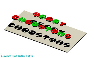
Here we see CAD'ed versions of Slimwall (greenish) and Fatboyslim (multicoloured), which - latter - gave me the idea for a Christmas card I think I posted here at the time - 2012? With a construction stage at bottom left, before I'd positioned the light-source for the shadows, and at bottom right, my prepared design doubled for printing on A3 card-stock. Which is here again! Well, it's only about six weeks away now! You use a single 'light' so the lines from the shadows, followed-back through the letters, all go to a single vanishing-point to enhance the 3D effect of the letters floating over the 'card' on the card!And no matter how bad the year's been I hope over the next few weeks, your Christmas this year shapes up to be better than the last two - it can't just keep getting worse . . . can it?
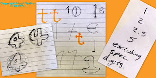
Some other stuff, even in the digital age, it seems a lot of paper still finds its way into the project folder, not all of it explainable, but clearly I've started tackling the numbers and looking at font-size or kerning (ratios of gaps between certain pairs of adjacent letters) or something!?? I don't think I ever progressed beyond the numerals you can see here (left) or have even got to choosing a final from some of those where there are alternatives shown, but I was doing it in college-time and had other stuff to get on with.Once I had a near finished alphabet (right) I moved on to other things and haven't got much further, I tweak something from time to time, but time's short these days, although I hope one day to put a finished version on a free-site like DAFonts.
One change you may have noticed is that the parallel line 'rule' established by the original 'A' and 'B' from my teenage version, which was carried on with the 'C', 'E' and 'F' (still not happy with 'D'!) and then taken through the whole alphabet, has now been dropped for 'W' following the enforced 'angle rule' for 'X' and 'Y', which I think makes it much better, the 'W' isn't just an upside down 'M', but a new letter in its own right!
Indeed you wonder if the reason all those angled letters are all at the back-end of the alphabet ('Z' is another) might be because when they were codifying it (monks? a Caesar?), they'd run out of strait and curved shapes/combinations which were suitably different from each other!
But back to Slimshady . . . once I was 3D CAD'ing more complicated solids than the pulled-out 2D of Fatboyslim, the obvious final progression was a fully 3D Fatabet (top right), which replaced my signature panel on the 'paper space' drawing files - main/left-hand image, taking the original circular disc concept to a full sphere.New 'W' mind! The constriction of boolean geometries meant some simplification to get the curved ogee 'edges' to go-in properly! In simple terms, boolean means "Right, OR wrong, there is NO grey", and if your invisible mesh, underlying everything, has a single fault, the whole thing is 100% wrong!
I'm actually tackling a letter 'R' in the bottom-right shot and you can see how you pull-up the 2D 'R' (white lines), leaving you with an extruded, R-shaped rod (red lines), which you then subtract from a solid sphere (pink Lines) leaving you with a stable ball-letter, that then needs some sharp-edges rounding-off, which is where it can all go very wrong; if the continuous ogee (which runs right around the edges of each 'trench' or hole) won't go-in when told to!
For instance, the ogee running round the larger trenches in the 'H', have to have a greater radius than the smaller trenches in the 'W', which can affect the visual uniformity of the different letters in the alphabet, a uniformity which is precisely what I've been trying to achieve sine 1981! 'D' notwithstanding - the bastard, so; you have to compromise at each stage, but these two look OK together . . . I think?
And . . . it's all good fun, that's the
thing, it's another skill, it's another life-experience, you know? Another box
ticked in an otherwise miserably short life. Parachuting is still on the list!
Thursday, January 20, 2022
B is for Blobby Blobby!
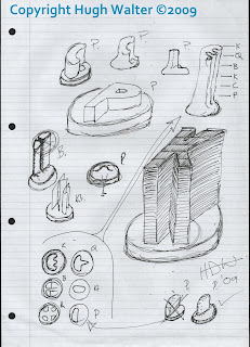
It started with a sketch, I had thought that you could have a chess set where the pieces were simply letters identifying the role of the piece, P for Pawn being the starting point, I then extruded the King to denote his seniority - despite the original idea being small flat magnetic 'travel chess' pieces - before I knew where I was going I had abstracted the Bishop (B), gone back to the Pawn, had another go at the King (top, and top-right), designed all their plan profiles (bottom-left) and got a Mk1 Pawn - bottom right. New sheet of paper; and designs I was happy with were quickly thrown-up, they aren't all the final designs, but the base was pretty-much decided upon and the idea of fluid lines and abstract designs were established, I was aiming for something between sand-blasted wood, and those turd-towers you make on the beach by dribbling very wet sand through your fingers. Well, some of us did!
Some of you will already have spotted an obvious mistake, but like walking away from a crossword puzzle and returning to it to get the clue you're stuck on, or after the 'Can't see the wood for the trees' aphorism, it took me (and the various tutors/fellow students involved in the below images) until preparing this article to spot it, so I'll save admitting it to the end!
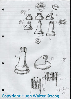
I then modeled working prototypes in air-drying clay; the king's a bit droopy! I only have this low-res' crop out of a larger image of the old 'Cabinet of Curious Things', but a few years later I would be off on the CAD course, and these became a step on the way! Pretty-much as the clay ones but the Castle now wears a simplified version of the King's crown, and the Knight has lost his bulgy-eyes for little pin-pricks which only hint at a face, the bishop gets a deeper valley between finer sides to his mitre-hat. This is still a 2D flat space drawing, coloured with a gradation tool in the lower image to give a false appearance of 3D.Chees Set! Heay; they're working drawings
in cyberspace! It's an idea though, with that plastic American cheese - you could injection-mould them and once the game was finished (pawns/queens) you could eat them with crackers and a nice wine!
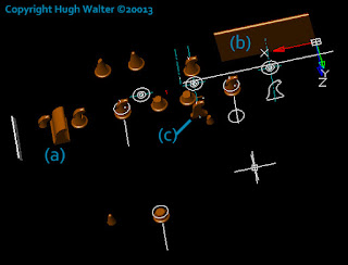
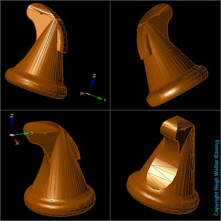
It was a bit like that with my Knight in the end, instead of lathe, saw and blade, I had the Boolean commands of extrusion, union, and subtraction, but it's a messy business while it's happening! I won't bore you with a detailed explanation of the steps but the main one is to pull out the whole profile (a), and the width of the head (b), subtract them from each other to get (c), which you then tweak with a standard base!
In the end I added a mane (of sorts) and the final piece works I think? I know some abstract, graphical or 'space-age' chess sets have Knights which don't look like 'knights', but in the end I felt a little homage to Jacques was in order! I don't seem to have replicated him four times and coloured him properly for these screen-shots but you can see how he'll slot-in and I think the overall works, the idea is to get it on one of the 3D printing sites, it'll be free, I can't see demand making it commercially viable and if it's free you can forget it once you've uploaded it! But he is here in this outline screen capcha'. The 'deliberate' mistake . . . I've got the King and Queen the wrong way round, the nipple should be the King and taller, while the rubber-glove full of air should be the Queen, and shorter! It's an easy job to switch them, but fancy not noticing for what's been 13 years since the first sketch! Anyway, I think it works and it'll give the haters something else to hate!Copyright Hugh Walter ©2009-2022
Monday, February 15, 2016
S is for Streached Strechy Streacher
From 'Stylist' magazine, another piece of free-sheet, train-floor snow! Have you seen anything toy related in a magazine or newspaper?
Thursday, February 4, 2016
D is for Deetail Details!
Just a comparison between the earlier silver and later Black Storm mounted Deetail Knights from Britains. The later one having the marginally more realistic appearance...apart from the chrome shield!
Also found this unused graphic I CAD'ed-up during the original series of articles, on the Britains dongle when putting the images away...just for fun...or something!
Tuesday, August 12, 2014
M is for More Loose-ends
[Couple of hours later - re-edited the thing for the umpteenth time, seems to be a little clearer!]
I've also not got bogged down with the thin versions as it's a new development which will require more work which someone else may do as I'm not volunteering at present! I've only identified the two knights and a couple of Turks so far and I think some of the mounted poses got slim-Jim versions?
All dates are very 'approximate', you can't trust the catalogues, and with other variables they may have languished in shops for some time or not been available when they should have been!
This is an earlier draft which may be of more use for printing out and using as a check-list, or to pin-up near the PC for when you are surfing evilBay? Left-click to enlarge.
If anyone would like the original Word .doc, that's doable, but with 12 jpg's embedded, it may not be eMail-able, so some cost for disc and postage would need to be worked out...I'd probably do all the jpg's (30-odd) and the AutoCAD file - if you can use it - as well?
Wednesday, June 11, 2014
U is for Ugly Underside of Undulating UFO
I filled the holes with blue 'glass' 5mil shorter than the cavity, and faced the cavities with an off-white light source, it looks better on a PC with a better graphics card, the Laptop simplifies the effect. H
Friday, May 24, 2013
P is for Petulant Pepperpot Peters-out Protesting Punishment
This was the final printout, it's a bit crowded for an A4/A3 sheet (we actually printed it in A3 and it's not too bad), but I'm hoping to get it printed A2 on the high street at some point, for the portfolio, and it's designed to show of a range of skills for a potential employer, who will hopefully realise that I can arrange things just as neatly with a little more room!! The grey box-lines and boarder shadows are a lap-top/Picasa thing, showing the hidden viewports?
The finished beast, not really 'finished' but I got enough detail into the breast-plate and toolboxes to con the casual observer, although I've just noticed the UCS is showing...doh!..Er...no...that's the new Dalek external temperature (red) air-speed (blue) and altitude (green) pitot, they're all having them fitted...now they can fly!
I am hoping to come back to it in a couple of months and attack the mid-section in 'Inventor' which may be a better tool for the sort of free-form shapes and intersecting arcs that make up the 'contours' of the shoulder area. But I am pleased enough with the final beastie to have bored you with it for the last couple of weeks! Back to toy soldiers....
Wednesday, May 22, 2013
LFA is for Low Flying Alien!
I need to do a lot of chamfering to the various shelves that run round the mid-section, but AutoCAD has decided not to let me do that now, nor will it let me put in fillets as a cheat, so now I know I can do it I may go back and do it again, after getting the chamfers done first.
I still need to sort out the chest piece, which still needs a couple of bolt-heads and a cut-out. At some point the two tool/weapons have come forward of their boxes "...while I wasn't looking your honour!" and will need to be pushed back, and the same boxes need little angled cut outs on the flat outer side, but otherwise well pleased with it and it's as far as I can go on this course really, so I need a job with a firm that will push me further...I can relocate?!!
Friday, May 17, 2013
T is for Tear Your Hair Out!
1. Tear you hair out, it is far easier to do this at the start when you are still fresh and innocent of what is to come, than to do it at the inevitable point where all hope is lost and the dark walls of reality are closing-in.
2. Go and find something to do that will bring greater reward and satisfaction in a shorter time period...this author suggests naked lion-wrestling.
3. Er...that's it.
So, the head; I nearly continued "went together quite easily", but it took most of a week! To be fair, the neck/face grid/visor thing was surprisingly easy and I got that done in a day, but the rest was a shed-load of faffing about, and while it looks 'like' the totally fictional (and themselves differing from episode to episode or even individual to individual) mutated Kaled's, there have been various tweaks and compromises (for compromise read 'Feck-it! That'll do...it looks all right') to the point where it's really an approximation of an NSD.
The helmet and eye-stalk would make an excellent Sci-fi automated gun-turret/coastal artillery bunker thing, which had me and Tom placing naval gun-barrels in the slot to see what they'd look like...they look good! And (never start a sentence with 'and', yes Swan'y I know!) as it's a .dwg file it can be 3D printed pretty much 'as is', and could be scaled to any ratio with a couple of key-strokes.
Indeed, trying to find decent CAD files on-line (yes - to cheat!) I've discovered there aren't any really, there's a beautifully rendered black one somewhere and some nice construction drawings for home-builders to knock-up Daleks from plywood and resin...and bits of washing machine, but a dearth of CAD drawings, so if I get this finished I thought I might offer the files (there are several now, the original drawing got so code-heavy it kept crashing the PC...at three o'clock every day!) on a CD on FeeBay, I have no idea if it would sell, but discs of far more boring CAD-stuff do seem to sell so...?
Speaking of 'if I finish it'; note how I've cut the shoulders off in the screen-grab...I thought that if I could master the head, I could go back to the shoulders with the certainty of success; I had a second attempt this morning - I thought wrong...like I said; easier to tear you hair out at the start and find something safer to do...base-jumping from urban-semi's anyone?
Wednesday, May 8, 2013
D is for Doctor Doubts Definite Defeat of Dastardly Daleks - Drat, Drat and Double Drat!
Joking apart, this is my attempt to produce a 3D 'Solids' Dalek, and it's doing my head in! I have now spent two days on the shoulders (the base and skirt were quite easy), and it's still not right, the head should go together quite well, it's just a series of stacked dishes with a mesh screen (that's real-world mesh not 3D 'Mesh'!) and a bowl!, but the shoulder is a series of non-circular roundy-shapes with a single mirror-symmetry front-to-back, and all the centre-points are off the 'centre-line' (such as there is one?).
The dark brown ones were my final attempt to get the indent that runs round the cone, and by the time I'd failed to get a workable shape from either of the subtracts I tried I realised I'd have to start again with the green one at the back, which means doing the weapon-boxes again, and they took me a long morning to get right last time!
And to any experienced CAD-monkeys out there...is there any trick to prevent the WCS turning into an unknown UCS, without you noticing because you've brushed a surface in passing? That is; other than throwing a brick at the screen!
Tuesday, January 29, 2013
B is for Best...eMail Ever!
Unfortunately I can't explain (yet) what it pertains to, but at last I have done something of which I can be pleased with, that required teamwork (thanks guys) and a bit of risk....I got £104 as well, and others have benefited and more will...in total I reckoned - on the back of a fag-packet - the 'financial irregularity' (for want of a better phrase while investigations are ongoing) totalled in excess of £10,000, taken from some of the people in society who could least afford it...watch this space, there's more to come...
As to the language? Us retards can call each other what we like!
Friday, December 14, 2012
M is for Merry Christmas
12 Days to Christmas, better get the tree up and start stuffing myself with stollen, tangerines, mince-pies, family packs of 'bisquits', Quality Street and anything else I can lay my hands on that might get me in training for the big day!!!
So - I'm finally getting to grips with 3D and after a frustrating week on 'mesh' or basket-weaving as I call it, I had a bit of a play with 'solids' yesterday and lighting for shadows, so this is the first self-designed Christmas card wot I done did since primary skool init! More festive and less technical-exercise one next year I promise....
I still have all the Corgi/Matchbox articles to post and the French stuff, but time has waited for no man in what has been a very interesting year, however, I will try to get some catch-up done in the next four weeks.


